We are starting a series of lectures on color harmony, without which it is impossible to achieve the unity of human color and the color of clothing. Before presenting the material, I will immediately add on my own behalf that our task, as researchers and practitioners of color type, is complicated by the fact that we need to know the laws of harmony in general, see the harmony of a person’s color and be able to combine the color of the herderob, if I can say so about it, and the color of a person into a single, coloristically and stylistically harmonious whole.
Many would argue that harmony is subjective. However, the laws of color harmony have been known since antiquity, they exist as an objective reality within the framework of subjective human perception, they are well studied and tested in practice. And even if we mentally disagree with some particular case of harmony, our eyes will still demand a balance of power.
I will try to quote as much useful material as possible in these chapters, without skimping on volume, since this is very important, and it is better to assimilate the postulates of harmony slowly but surely. We will figure it out together, myself included, based on the works of authoritative experts.
Today I will start with a large volume of lyrics for starters, there will be few pictures today, read the text.
Below I quote the work of Valentin Zheleznyakov, “Color and Contrast,” already mentioned in previous chapters on contrast.
In the era of Greco-Roman antiquity, color became the subject of attention and reflection of philosophers, but the views of color philosophers can be called more artistic than scientific, because their worldview was based on aesthetic and even ethical prerequisites. Ancient philosophers considered it obligatory to classify colors - to distinguish main and derivative ones, but they approached this mainly from a mythological position. In their opinion, the main colors should correspond to the main elements (air, fire, earth and water - white, red, black and yellow). Nevertheless, Aristotle already knew the phenomenon of color induction, simultaneous and sequential color contrast, and many other phenomena, which were then used as the basis for physiological optics. But the most important thing is the doctrine of color harmony.
Ancient color aesthetics became the same foundation for all European art of the Renaissance as ancient philosophy was for the science of the Enlightenment. Harmony was considered a universal principle of the universe and was applied to many different phenomena: to the structure of the Cosmos, to the social structure, to architecture, to the relationship of colors and numbers, to music, the human soul, etc. In its most general form, harmony meant the principle of a higher, “divine” order, established not by man, but by higher powers, but, despite this, such an order should be completely accessible to human understanding, since it is based on reason. This, by the way, is the difference between the Western concept of harmony and the Eastern one, in which there are always elements of mysticism and unknowability.
Here are some provisions of ancient harmony in relation to color:
1. Communication, the combination of individual elements of the system with each other. Harmony is a connecting principle. This is expressed in color unity of color tone, when all the colors are brought together as if by a common patina, each paint is either whitened (in the background), or blackened, or softened by mixing another paint. Apelles, according to Pliny, having completed the painting, covered it with something like a grayish varnish in order to bind all the colors into a harmonious unity.
2. The unity of opposites, when certain opposite principles are present, called contrasts. In monochromes, this is the contrast of light and dark, chromatic and colorless (for example, purple with white, red with black), saturated colors with low-saturated ones. Or are they contrasts in color tone - a comparison of red and green, yellow and blue, etc., i.e. connection of additional, complementary colors.
3. Only something connected with a measure can be harmonious., and the measure is human sensations and feelings. According to Aristotle, every sensation is a determination of relationships. The brightness and strength of the color should be neither too strong nor too weak. Bright colors and sharp contrasts were considered barbarism, worthy of “some Persians” (the original enemies of Hellas). A civilized Greek values beauty more than wealth; the subtlety of art pleases him more than the high cost of material.
4. The concept of measure is relative, it means the ratio of the measured quantity to the unit of measurement, therefore it includes such definitions as proportionality, proportions, relationships. Aristotle believed that in “beautiful” colors the proportions in which the primary colors are taken are not accidental: “Those colors in which the most correct proportionality is observed, like sound harmonies, seem the most pleasant. Such are dark red and violet... and some others of the same kind, of which there are few for the reason that musical harmonic consonances are few.”
The entire practice of ancient applied art is based on the principle that mixedness in color is more valued than purity.
5. The harmonic system is stable because it is balanced. The Universe is eternal because it is harmoniously arranged; the opposing forces in it cancel each other out, creating a stable balance. If in the picture the figures are dressed in bright cloaks, then these relatively saturated spots occupy no more than one-fifth or one-sixth of the entire picture in area. The remaining colors are low-saturated. Light to dark is taken in approximately the same ratio. Thanks to this proportional system, an overall balance of the color composition is achieved: strong, but short pulses of bright and pure colors are balanced by longer, but weak fields of dark and mixed ones.
6. A sign of harmony is its clarity, the obviousness of the law of its construction, simplicity and logic both as a whole and in parts. A classic color composition does not pose difficult tasks for the viewer; comparisons of close or opposite colors are preferred in it and comparisons in the middle interval are almost never used as a color dominant, since they have neither an obvious connection nor opposition (more on this will be said using the example of color circle).
7. Harmony always reflects the sublime. According to Aristotle, “mimesis” is a reflection of reality in the forms of reality itself; art only imitates nature, but does not reproduce the ugly and ugly - this is not the task of art.
8. Harmony is conformity and expediency, as well as order. This principle expresses in the most general form the attitude of ancient aesthetics to the world: the goal of human cultural activity is to transform the formless and ugly world of chaos into a beautiful and ordered cosmos. Any harmonious color composition is so organized and orderly that it is easily comprehended by the human mind and lends itself to logical interpretation.
From this listing of the main features of ancient color harmony, it is clear that many of them have not lost their meaning to this day.
The German poet Wolfgang Goethe wrote: “Everything that I have done as a poet does not fill me with special pride. Wonderful poets lived at the same time as me, even better ones lived before me and, of course, will live after me. But what am I in my age? the only one who knows the truth about the difficult science of colors - I cannot help but attach importance to this, it gives me a sense of superiority over many."
Goethe fundamentally and ideologically differed from Newton’s position and believed that he had to fight his “delusions.” He looked for the principle of color harmonization not in physical laws, but in the laws of color vision, and we must give him his due, he was right in many respects; It is not without reason that he is considered the founder of physiological optics and the science of the psychological effects of color.
Goethe worked on his “Doctrine of Color” from 1790 to 1810, i.e. twenty years, and the main value of this work lies in the formulation of subtle psychological states associated with the perception of contrasting color combinations. Goethe describes in his book the phenomena of color induction - luminance, chromatic, simultaneous and sequential - and proves that colors arising from sequential or simultaneous contrast are not random. All these colors seem to be inherent in our organ of vision. The contrasting color appears as the opposite of the inducing color, i.e. imposed on the eye, just as inhalation alternates with exhalation, and any compression entails expansion. This reveals the universal law of the integrity of psychological being, the unity of opposites and unity in diversity.
Each pair of contrasting colors already contains the entire color wheel, since their sum is white- can be decomposed into all imaginable colors and, as it were, contains them in potency. From this follows the most important law of the activity of the organ of vision - the law of the necessary change of impressions. “When the eye is offered something dark, it demands light; it demands something dark when it is presented with something light, and it demonstrates its vitality, its right to grasp an object by generating from itself something opposite to the object.”
Goethe's experiments with colored shadows showed that diametrically opposite (complementary) colors are precisely those that mutually evoke each other in the viewer's mind. Yellow requires blue-violet, orange requires cyan, and purple requires green, and vice versa. Goethe also built a color circle (ill. 13), but the sequence of colors in it is not a closed spectrum, like Newton’s, but a round dance of three pairs of colors. And these pairs are additional, i.e. half generated by the human eye and only half independent of man. The most harmonious colors are those that are located opposite, at the ends of the diameters of the color wheel, they call each other and together form integrity and completeness, similar to the completeness of the color wheel. Harmony, according to Goethe, is not an objective reality, but a product of human consciousness.
According to Goethe, in addition to harmonic combinations, there are “characteristic” and “characterless”. The first includes pairs of colors located in the color wheel through one color, and the second - pairs of neighboring colors. Harmonic color, according to Goethe, arises when “all neighboring colors are brought into balance with each other.” But harmony, Goethe believes, despite all its perfection, should not be the artist’s ultimate goal, because what is harmonious always has “something universal and complete, and in this sense devoid of specificity.” This unusually subtle remark echoes what Arnheim subsequently said about the entropic nature of the process of image perception and the fact that images harmonized in all respects often lack expressiveness and expression.
Goethe's book contains several very subtle definitions of color. For example, in painting there is a technique of shifting all the colors to any one color, as if the picture was viewed through colored glass, for example yellow. Goethe calls this coloring false. “This false tone arose from instinct, from a lack of understanding of what should be done, so that instead of integrity they created homogeneity.” A similar color glaze, often considered a sign in color cinematography good taste, does not deserve such a respectful attitude at all and that there are other, more advanced ways of obtaining color harmony, which, however, require more work and a higher visual culture.
Harmony is a philosophical and aesthetic category, meaning integrity, unity, natural coherence of all parts and elements of the form, i.e. This high level the orderliness of diversity and the correspondence of parts within a whole that meets the aesthetic criteria of perfection and beauty.
Color harmony is a combination of individual colors or color sets that form an organic whole and evoke an aesthetic experience.
Color harmony in design is a certain combination of colors, taking into account all their main characteristics, such as
Color tone;
Lightness;
Saturation;
The sizes occupied by these colors on a plane, their relative position in space, which leads to color unity and has the most favorable aesthetic effect on a person.
Signs of color harmony:
1) Connection and smoothness. Connecting factors can be: monochrome, achromaticity, unifying mixtures or patinas (mixture of white, gray, black), a shift to some color tone, gamma.
2) Unity of opposites, or contrast. Types of contrast: by brightness (dark-light, black-white, etc.), by saturation (pure and mixed), by color tone (additional or contrasting combinations).
3) Measure. Those. in a composition brought to harmony there is nothing to add or remove.
4) Proportionality, or the relationship of parts (objects or phenomena) between themselves and the whole. In gamma, this is a similar relationship between brightness, saturation and color tones. Let's consider the ratio of the areas of color spots:
1 part light field - 3-4 parts dark field;
1 part pure color - 4-5 parts muted;
1 part chromatic - 3-4 parts achromatic.
5) Equilibrium. The colors in the composition must be balanced.
6) Clarity and ease of perception.
7) Beautiful, the pursuit of beauty. Unacceptable psychologically negative colors, dissonances.
8) Sublime, i.e. perfect combination flowers.
9) Organisation, order and rationality.
Picture for variety and reflection from the same site:

So, today we mentioned the concept of color, but we will look at color and scale in more detail later. In the next lecture, we will consider the general provisions of Itten’s theory of harmony, and then, first briefly, and then in detail in 1 lecture on the type of harmony, we will consider how the relationships of color harmony are solved practically on the color wheel.
Homework will be of a philosophical nature, please speak out in the comments: what is color harmony for you, on what basis do you conclude what is harmonious and what is not, and what is beautiful for you and what is not?
Contemplation by the human eye of the colors of the surrounding world begins from the moment of its birth and carries a significant semantic load. The brain receives over 80% of information through visual perception, and it is from this that the idea of space and reality as a whole is formed.
The beginning of the beginning: why harmony is necessary
The nature of planet Earth is full of extraordinary places, the variety of colors and bright shades of which amaze the imagination. Richness and depth of hidden corners globe have always excited the souls of designers, artists and simply connoisseurs of beauty. That is why nature has become the basis for choosing a palette and a source of emotional inspiration for creative people.
The designer’s task is to take as a basis the consonance and unconstrained beauty of nature, to create something no less beautiful, but with a touch of individuality. In order to accomplish this task brilliantly, it is necessary to understand the principle of interaction of colors and shades, the features of visual perception, and the impact of certain combinations on the human subconscious. For this purpose, a palette of color harmony was created.
General classification of flowers in the world
The first systematics was made by Isaac Newton, who divided a light ray into seven colors using a prism. Now these shades are considered to be the rainbow - red, orange, yellow, green, purple. Newton combined colors into a schematic circle in an attempt to create the first palette.

The modern color harmony classifies shades according to two criteria:
1. Achromatic - white and black, as well as all varieties of gray, gradually gaining saturation on the way from white to black.

2. Chromatic - all other spectrum) and their shades, rich and rich.
Separation of colors in gamut
The chromatic group of the spectrum is usually subdivided in more detail:
- Primary (red, yellow, blue). They are basic in creating further colors and their variations.
- Secondary, or composite (orange, green, purple). Extracted by mixing primary colors.
- Mixed. These include all other colors created by combining various shades.
In the latter variety, neutral colors are highlighted as a separate item - black, white and gray.

Groups of harmonic combinations
The harmony of colors is expressed by four types of combinations, identified on the basis of combining a palette of primary and secondary shades:

The effect of flowers on humans
Shades have not only an aesthetic effect on the human body, but also a pronounced psychological and physiological effect. Let's look at the main colors that affect the human body:
- Red. It is an stimulating shade, raises vitality, increases heart rate, and stimulates the brain and liver. However, all this has a negative impact on nervous system and limited in case of allergies and aggression.
- Orange. Gives a boost of activity and optimism, has a positive effect on the nervous system and gastrointestinal tract, and increases appetite.
- Yellow. Strengthens the nerves, is beneficial for depression, has a great effect on intellectual abilities and memory, and helps cleanse the intestines and liver.
- Green. It is beneficial for the eyes and heart, has a general calming effect on the body and psyche, and lowers blood pressure.
- Blue and blue. These colors are soothing and peaceful, having a positive effect on the nervous system, eliminating the feeling of powerlessness and pain in the body.
- Violet. Has a positive effect on internal organs, helps with insomnia and migraines.

Spring and summer colors in the "seasons concept"
The classification according to the “concept of seasons” was inspired by the harmonious shades of nature itself. After all, where else if not here do we encounter the most unexpected combinations directly related to seasonal changes. There are spring, summer, autumn and winter groups. In each palette there is one predominant color that actively dominates the others in brightness or volume.

Autumn and winter shades in seasonal theory
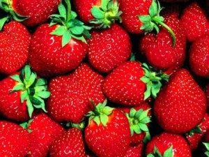
- Autumn in the palette. Perhaps this time of year can be called the richest in variety of shades. The harmony of colors is reflected in the rich harvest of mushrooms, berries and fruits, as well as color-changing foliage. The primary color is red, accompanying colors are reddish-brown, corn, orange, peach, blue, pine, olive, coffee, plum.
- Winter. Memories of this time paint us monochrome landscapes, quiet and hidden nature under a blanket of snow. And on this almost white canvas, bloody rowan berries, spruce needles and a frosty sky stand out. The colors of the season, although cool, are distinct and pure, without any additions. The dominant color in the palette is blue; snow-white, turquoise, blood red, black, dark blue, intense brown, beige, and blue are also present.

Summing up
Despite the fact that the beauty of natural shades seems complete and does not need modification, there is no need to thoroughly transfer it to an object artificially designed by man - be it interior design or the creation of a designer item. Blatant copying and transfer of pure natural tones into a world artificially created by human hands looks ridiculous, and the harmonious relationship of natural shades is violated.
To prevent this from happening, you need to learn how to harmoniously mix natural and artificially formed shades into a palette. It is important to have innate taste and the ability to correctly match colors to each other to create perfect interior, paintings or external image. All the above diagrams and notes will help a creative person with this.
Color harmony
When people talk about color harmony, they are evaluating the impressions of two or more colors interacting. Painting and observations of the subjective color preferences of various people indicate ambiguous ideas about harmony and disharmony. As a rule, the assessment of harmony or dissonance is caused by the feeling of pleasant-unpleasant or attractive-unattractive. Such judgments are based on personal opinion and are not objective.
The concept of color harmony must be removed from the area of subjective feelings and transferred to the area of objective laws.
Harmony is balance, symmetry of forces.
Physiologist Ewald Hering made the following remark: “Medium or neutral gray color corresponds to the state of the optical substance in which dissimilation - the expenditure of forces expended on the perception of color, and assimilation - their restoration - are balanced. This means that the medium gray color creates a state of balance in the eyes.” Hering proved that the eye and brain require medium gray, otherwise, in its absence, they lose calm.
Processes occurring in visual perception cause corresponding mental sensations. In this case, harmony in our visual apparatus indicates a psychophysical state of equilibrium, in which dissimilation and assimilation of the visual substance are the same. Neutral gray corresponds to this condition.
Two or more colors are harmonious if their mixture is a neutral gray.
All others color combinations that don't give us gray, by their nature become expressive or disharmonious. In painting, there are many works with one-sided expressive intonation, and their color composition, from the point of view of the above, is not harmonious. These works are irritating and overstimulating with their emphatically persistent use of one dominant color. There is no need to say that color compositions must necessarily be harmonious, and when Seurat says that art is harmony, he confuses artistic means and the goals of art.
The basic principle of harmony comes from the physiological law of complementary colors. In his work on color, Goethe wrote about harmony and integrity this way: “When the eye contemplates a color, it immediately comes into an active state and, by its nature, inevitably and unconsciously immediately creates another color, which, in combination with a given color, contains the entire color circle . Each individual color, due to the specificity of perception, forces the eye to strive for universality. And then, in order to achieve this, the eye, for the purpose of self-satisfaction, searches next to each color for some colorless empty space into which it could produce the missing color. This shows the basic rule of color harmony.”
Color theorist Wilhelm Ostwald also touched upon issues of color harmony. In his book on the basics of color, he wrote: “Experience teaches that some combinations of certain colors are pleasant, others are unpleasant or do not evoke emotion. The question arises, what determines this impression? To this we can answer that those colors are pleasant, between which there is a natural connection, that is, order. We call color combinations, the impression of which we are pleased, harmonious. So the basic law could be formulated as follows: Harmony = Order.
We can draw a general conclusion that all pairs of complementary colors, all combinations of three colors in the twelve-part color wheel, which are connected to each other through equilateral or isosceles triangles, squares and rectangles, are harmonious.
Yellow-red-blue form the main harmonious triad here. If these colors in the twelve-part color wheel system are combined with each other, we get an equilateral triangle. In this triad, each color is presented with utmost strength and intensity, and each of them appears here in its typically generic qualities, that is, yellow acts on the viewer as yellow, red as red and blue as blue. The eye does not require additional additional colors, and their mixture gives a dark black-gray color.
Yellow, red-violet and blue- purple and is united by the figure of an isosceles triangle. The harmonious consonance of yellow, red-orange, purple and blue-green are united by a square. The rectangle gives a harmonized combination of yellow-orange, red-violet, blue-violet and yellow-green.
A bunch of geometric shapes, consisting of an equilateral and isosceles triangle, a square and a rectangle, can be placed at any point on the color wheel. These shapes can be rotated within the circle, thus replacing a triangle consisting of yellow, red and blue with a triangle combining yellow-orange, red-violet and blue-green or red-orange, blue-violet and yellow-green.
The same experiment can be done with others. geometric shapes. Further development of this topic can be found in the section devoted to the harmony of color harmonies.
Types of color harmonies and principles of their construction
Each of us has “comfortable” colors in clothing and personal items; everyone has noticed that it is pleasant for him to be in one room, but uncomfortable and depressing in another. Scientists have long proven the effect of color on heart rate, breathing rate, blood pressure and muscle tension.Based on emotional associations, the impact of color is divided into positive, negative and neutral. Exciting colors include red, orange and yellow. For depressing ones - purple, dark gray and black. For calming ones - green and blue. Equally important are the physical associations of colors: weight (light, heavy), spatial (protruding, deep), acoustic (quiet, loud) and texture (soft, hard, smooth).
IMPACT OF COLOR: There is no friend for taste and color
This proverb reflects the reality of the effects of color like nothing else. It has been found that different psychotypes prefer certain colors, as shown in the figure below.
For example, we can recall the colors of the youth movement “emo”, based on experiences, emotions and suffering in creativity, music and style. Their main colors are depressing black combined with pink, giving a melancholic state.
It was also found that the same colors can be associated differently by people. The cleaner and brighter color, the more intense and stable the reaction. Complex, low-saturated, medium-light colors cause different (unstable) and relatively weak reactions. The most unambiguous include temperature, weight and acoustic associations. 
Yellow and green colors cause the greatest variety of associations, and therefore the different effects of color. This happens because the eye distinguishes the greatest number of shades in a given spectrum. In nature, these colors are most abundantly represented. Each shade of yellow or green is associated in the mind with a specific object, phenomenon, taste, hence the wealth of associations. Also, the color purple causes ambiguity due to its duality.
IMPACT OF COLOR: Color Harmony
It's no secret that some color combinations seem harmonious to us, while others, on the contrary, are ridiculous. Creating a harmony of colors in the interior is the key to the success of a harmonious life in the house.
The picture on the left shows simple models color combinations in the form of four harmonious colors. To build harmonies with other colors, you need to turn these shapes with their vertices in the desired color.
The principle of color harmony is built on diametrically distant pairs and triads, so you can find not only four harmonious colors, but also less and more, using halftones. For example, if you do not take into account the purple color, then a classic triad is formed in the top picture, and a contrasting one in the middle.
Do not apply colors in equal quantities. Harmony of colors is achieved through the main color (the background, usually less saturated) and accents. Contrast, brightness and saturation do not affect the rule of color harmony in any way; the principle remains the same.
COLOR HARMONIES.
In nature there are a large number of colors and their shades.The human eye is able to distinguish up to 360 shades. An ordinary person can distinguish fewer shades. It depends on visual acuity, the age of the person, the illumination of the space, the person’s mood and his state of health.
Colors are divided into two large groups: chromatic and achromatic. Chromatic - “colored”. Achromatic - white, gray, black.
The chromatic colors that make up white daylight are distributed in a certain order, depending on the wavelength.
Primary colors: yellow, red, blue. Composite colors: orange, purple, green.
Composite colors are made by mixing two primary colors:
■ Orange = red + yellow.
■ Purple = red + blue.
■ Green = yellow + blue.
All other colors consist of a mixture of these colors in different proportions. Plus the difference in saturation and lightness.
Colors are conventionally divided into warm and cold.
Warm colors are colors containing yellow and red. Cool colors are colors located from the violet to green zones of the color wheel.
Warm colors are more dynamic, prominent and voluminous than cool colors. Cool colors seem to recede as the tone increases.
Color has three characteristics: hue, lightness and saturation.
Hue is the presence of a primary color in a complex color, which determines its place in the color wheel.
The color tone is determined by the name of the color: scarlet, crimson.
Saturation is the difference between a chromatic color and a gray color of equal lightness.
Contrasts in clothing are important. Ornamental and rhythmic compositions are built on contrast.
Great contrast comes from colors located on opposite diameters of the color wheel: red-green, orange-blue.
Low contrast - colors that are at a 90 degree angle to each other.
Harmony is the basis of beauty. Color harmony = color balance.
10. Harmonies of combinations of chromatic colors of different hue, saturation and lightness (pure, whitened or blackened), with various achromatic ones. 
11. Harmonies of mixtures and combinations of rich chromatic colors with achromatic colors of different lightness. 
Dear friends,
When working with color, the goal of the artist or designer is to create color harmony.
Color harmony- this is the consistency of colors among themselves as a result of the found proportionality of their areas and shapes, balance and consonance, based on finding a unique shade of each color. This harmony should evoke certain positive feelings and sensations in a person.
According to the nature of psychophysiological perception, it is customary to subdivide harmonic combinations into five color groups: monochromatic harmonious combinations of colors, harmonious combinations of related colors, harmonious combinations of contrasting colors, harmonious combinations of related-contrasting colors and harmonic combinations “Triad”.
- Monochrome harmonic combinations built on the basis of one color. They are created by combining a chosen color with its light and dark shades, obtained by adding white and black. As a result, you can achieve, on the one hand, a strong tonal contrast, and on the other, subtle color relationships. The overall color tone gives monochromatic combinations a calm, balanced character.
Monochrome harmony
Depending on the tasks, color harmony can be organized in different lightness ranges. For example, using the full light range expresses peace and stability. The selection of colors separated from each other by different intervals contributes to the manifestation of activity and color intensity. To express dynamic contrast, choose two colors with a small tonal interval between them and a third with a larger interval. A uniform ratio of areas occupied in combined colors affirms statics, while an uneven ratio asserts dynamics.

Monochrome harmony in nature
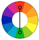
- Harmonic combinations of related colors achieved by using three colors that are adjacent to each other on the color wheel. Due to their proximity, these colors are easy to combine. This harmony can have a lot of depth, it is characterized by a rich originality and an elegant appearance. The harmony of related colors is based on the similarity of color tones (or on their slight contrast in color tone) and evokes a feeling of balance and calm.
Harmony of related colors
The introduction of a small amount of white or black into combinations of related colors leads to harmony and enhances the emotional expressiveness of the composition. Harmonies of related colors are characterized by active light contrast, which contributes to the expressiveness of tonal combinations. For example, three equally saturated color tones of equal lightness do not form subtle color combinations. As soon as you add black or white to two of the three colors you combine, the color combinations become consistent.

Harmony of related colors in nature
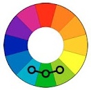
- Harmonious combinations of contrasting colors are created by using two colors that are opposite each other on the color wheel. This technique is usually used to create accents, since combinations of these pairs of colors have the greatest color contrast, causing an active sound, tension and dynamism of the composition. This allows one color to complement another in such a way that one is the focal point while the other is the background.
Harmony of contrasting colors
When starting to create contrasting harmonious combinations, first select the initial color, then determine the corresponding contrasting color. By creating a harmony of contrasting colors, you can add achromatic colors to each of the combined colors.

Harmony of contrasting colors. Square
"Square"- a type of harmonious combinations of contrasting colors from four colors, equidistant from each other.
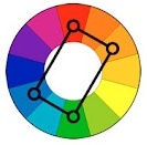
Harmony of contrasting colors. Tetrad
"Tetrad"- a type of harmonious combinations of contrasting colors of four colors, in which there are two pairs of colors located opposite each other.
Harmony of contrasting colors in nature
- Harmonic combinations of related and contrasting colors – the most common type of color harmonies, forming an isosceles triangle in the color wheel. Here harmony is achieved through the use of a color and colors adjacent to its complement. These colors are softer than simply combining two complementary colors.
Harmony of related and contrasting colors
A characteristic feature of composing harmonious combinations of related and contrasting colors is the presence in the combinations of the same number of main and contrasting colors.

Harmony of related and contrasting colors in nature
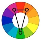
- 5. Harmonic combinations "Triad" - a combination of three colors equidistant from each other and forming an equilateral triangle in the color wheel. This scheme is popular among artists because it offers strong visual contrast while maintaining balance and color saturation. This composition looks quite lively even when using pale and desaturated colors.
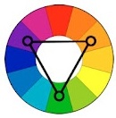
The Triad harmonies demonstrate very distinct and strong color combinations, but are the most difficult to create correctly. To achieve harmony in the triad, one color is taken as the main color, and the other two are used for accents.
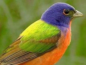
Triad in nature
However, it should be remembered that in creating color harmony, not only the colors themselves are of great importance, but also the configuration of the spots and the size of the areas of the compared color tones. There is an obvious relationship between the different colors of any composition, each color balancing or highlighting the other, and two colors together influencing a third. Changing one color leads to the destruction of coloristic, color harmony work of art and causes the need to change all other colors.